Bond Counseling
Work Completed at Mango Bay Internet
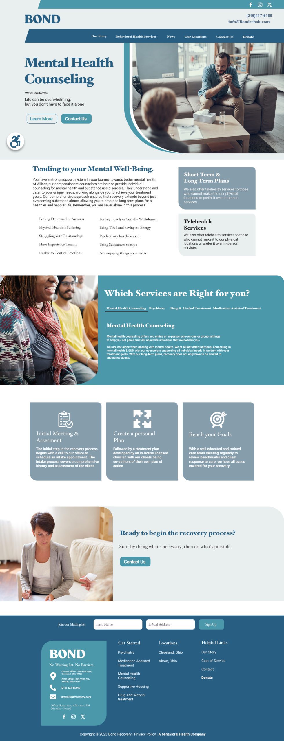
The Project:
A Professional and results driven online platform with the goal of converting first time and reoccuring visitors into patients.

Design Elements:
- Clean, professional healthcare aesthetic with blue and teal color scheme
- Accessibility icon prominent throughout
- Emotional, supportive imagery (parent with child, therapy sessions)
- Patient testimonials for credibility
- Clear call-to-action buttons (“Learn More,” “Contact Us”)
- Organized information hierarchy with easy navigation
Key Messaging: “Start the Recovery Process” and “We’re Here for You” – emphasizing support, hope, and the message that recovery is possible and no one has to face challenges alone.
Goal
Making Mental Health treatment feel approachable and stigma-free.
Create a compassionate digital gateway that removes barriers to mental health treatment
- Establish BOND as a trusted, accessible resource for individuals seeking behavioral health support
- Reduce stigma around mental health and substance use treatment through empathetic, human-centered design
- Convert website visitors into treatment-seeking clients through clear pathways and calls-to-action

Design Philosophy
The website employs a compassionate, trust-building design approach that reduces stigma around mental health treatment while maintaining professional credibility. The visual language balances clinical expertise with emotional warmth and accessibility.
Visual Design System
Color Palette:
- Primary Blue (#1B4B6B): Establishes trust, professionalism, and calm
- Teal Accent (#5DABB8): Creates approachability and hope
- Soft Grays & Whites: Provides breathing room and reduces cognitive load
- Strategic use of warm tones in photography to humanize the experience
Typography:
- Large, serif headlines create elegance and establish authority
- Clean sans-serif body text ensures readability
- Generous font sizing and line spacing accommodate users in distress
User Experience Strategy
Emotional Journey: The design guides users through a carefully crafted emotional arc:
- Hero Section: Immediate reassurance with uplifting imagery and supportive messaging
- Service Overview: Clear, digestible information without overwhelming
- Process Explanation: Transparency builds trust and reduces anxiety
- Social Proof: Testimonials validate the decision to seek help
Information Architecture:
- Scannable layouts with clear visual hierarchy
- Modular card-based design allows users to quickly find relevant services
- Progressive disclosure: Essential information upfront, details available on demand
- Logical flow from problem acknowledgment → solution → action
Accessibility & Inclusion
Prominent Accessibility Features:
- Accessibility icon visible throughout the site signals inclusive design
- High color contrast ratios for readability
- Clear, simple language avoids medical jargon
- Spacious layouts reduce visual stress for users in crisis
Mobile-First Approach:
- Responsive design ensures access from any device
- Touch-friendly button sizes
- Simplified navigation for users seeking help urgently
Interactive Elements
Call-to-Action Strategy:
- Dual CTAs (“Learn More” + “Contact Us”) accommodate different decision-making stages
- Teal buttons stand out without being aggressive
- Multiple conversion opportunities throughout the page
- Newsletter signup in footer for ongoing engagement
Navigation:
- Sticky header keeps contact information always accessible
- Clear service categories in main menu
- Footer with comprehensive sitemap and contact details
- Social media integration for community connection
Content Presentation
Visual Storytelling:
- Lifestyle photography (not clinical stock images) shows real recovery scenarios
- Rounded image masks soften the design and feel more welcoming
- Human-centered imagery: Parent-child bonding, therapy sessions, everyday moments
- Strategic use of white space prevents overwhelming users
Service Cards:
- Icon + headline + brief description format for quick scanning
- Consistent card layouts create predictability
- Teal accents guide the eye to key information
Trust-Building Design Elements
Credibility Indicators:
- Professional branding with consistent logo placement
- Testimonial sections with names and photos (or avatars)
- Process transparency (“How the Intake Process Works”)
- Contact information prominently displayed
- Privacy policy and compliance mentions in footer
Empathetic Messaging:
- “We’re Here for You” positioning
- “Life can be overwhelming, but you don’t have to face it alone”
- Non-judgmental, supportive language throughout
- Focus on recovery and hope rather than problems
Unique Design Strengths
- Stigma Reduction: Design feels more like a wellness brand than a clinical facility
- Dual Audience Accommodation: Serves both self-referred patients and court-mandated clients
- Crisis-Aware Design: Clear pathways to immediate help without navigation friction
- Family-Inclusive: Imagery and messaging acknowledge support systems
- Holistic Visual Language: Reflects the comprehensive, whole-person treatment approach
bond counseling

Joe Shepker.
Designer Trained for Web and Print mediums
joeshepker@gmail.com
