Water Finance Conference
Work Completed at Benjamin Media
The Problem: and How I solved it
Sketches & Mockups
The Results
Figma Link
The Problem:
The site was outdated and underpreforming
A comprehensive UX/UI redesign of the Water Finance Conference website, transforming it from a content-heavy informational layout to a visually engaging, conversion-focused experience that better communicates the event’s value proposition and drives registrations.
Opportunity:
The conference landing page serves as the primary driver for registrations. Small improvements to conversion rates compound significantly given the $595-$795 Admission Price.
Goal:
Increase registration conversions by 35-70% through systematic A/B testing and User Feedback.




Trust & Credibility
Before: Organizer information at bottom with minimal emphasis
After:
- 2025 sponsor logos featured prominently above the fold
- “Join 200+ water finance professionals” social proof
- Venue information with compelling description of the innovation center
- Specific speaker credentials and organizational affiliations
Design System Improvements
- Color Strategy: Maintained the brand’s blue and chartreuse palette but used more strategically for CTAs and emphasis
- Typography: Improved hierarchy with clearer distinction between headlines, subheads, and body copy
- Photography: Shifted from generic to specific, showing both infrastructure scale and human engagement
- CTAs: Consistent button styling with clear primary/secondary distinction
User Experience Enhancements
- Reduced Friction: Clear path from landing to registration with multiple entry points
- Scanability: Card-based layouts allow users to quickly assess session relevance
- Social Proof: Multiple indicators of event credibility and peer attendance
- Value Communication: Specific, tangible benefits rather than generic promises
- Urgency Creation: Date prominence and early bird messaging encourage immediate action
Before:

Goal
Boost Preformance & conversions
- Increase registration conversions by creating a more compelling visual narrative
- Improve information hierarchy to help visitors quickly understand the event value
- Enhance the professional appearance to match the caliber of attendees (CFOs, utility directors, municipal advisors)
- Streamline the user journey from awareness to registration
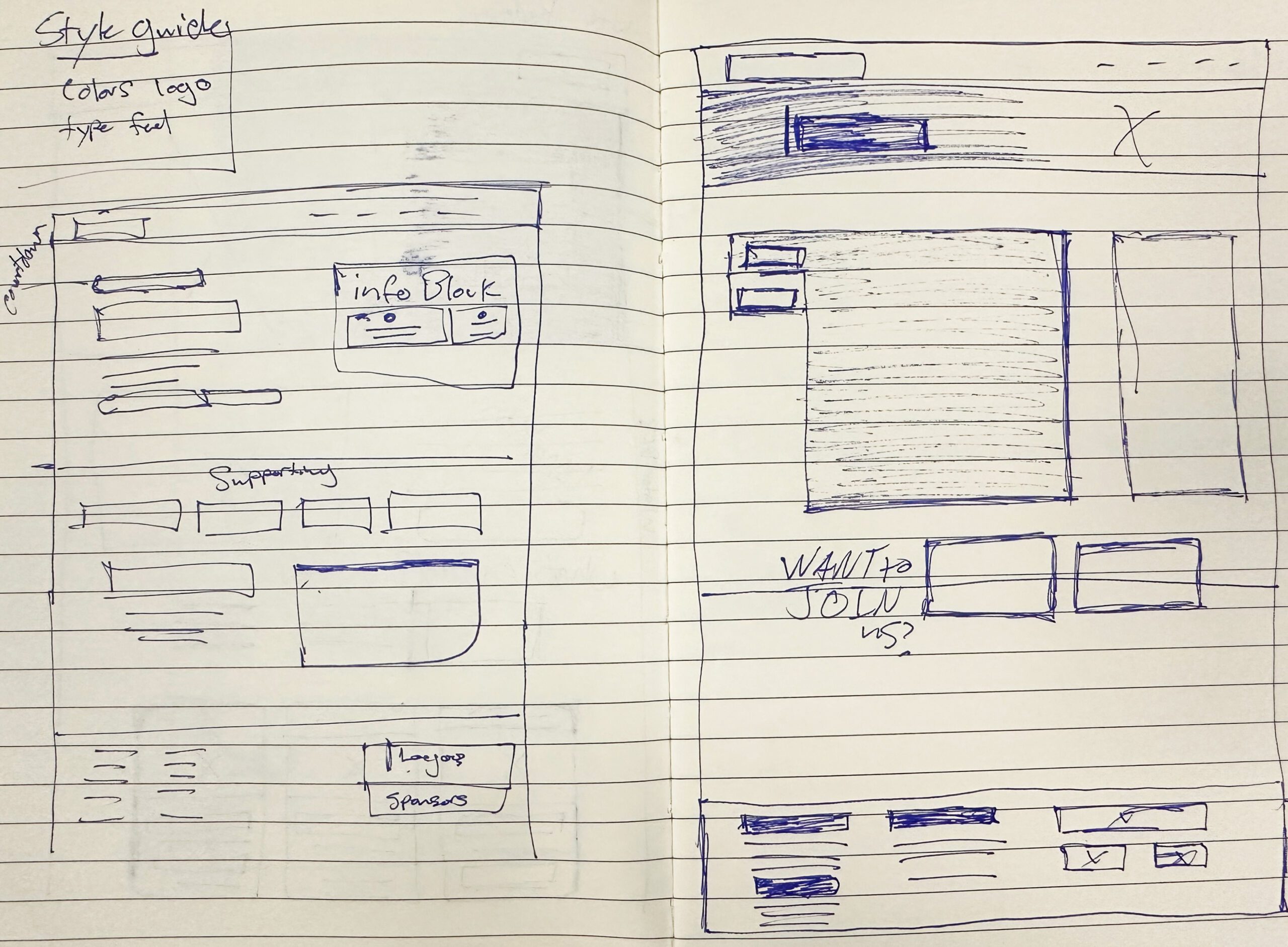
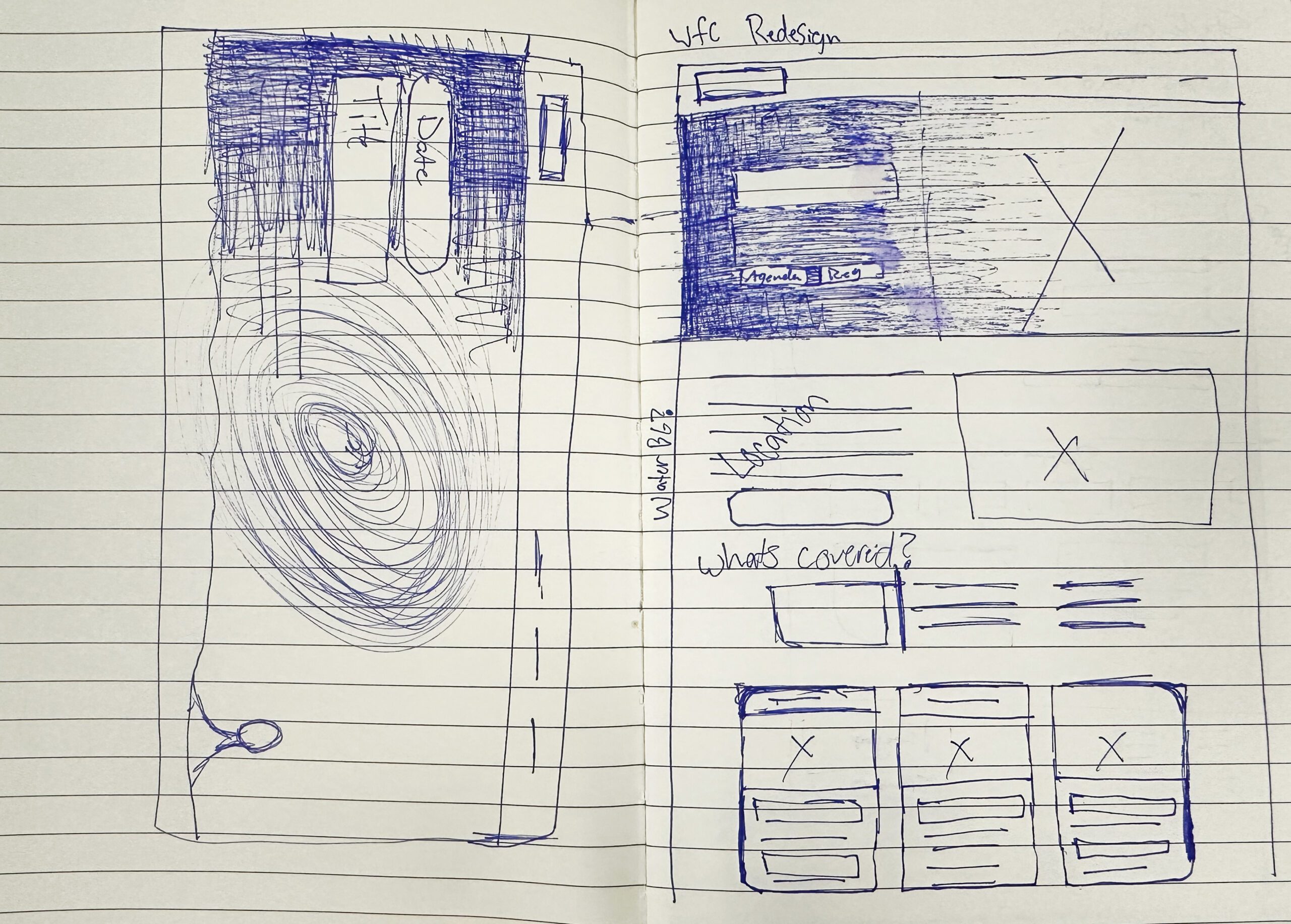
After:

Redesign Improvements:
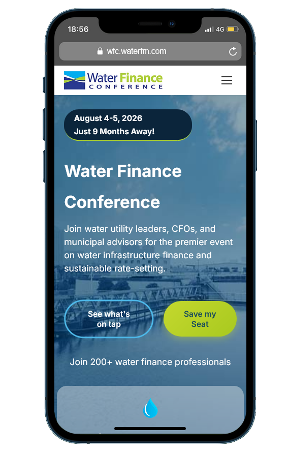
- Darker overlay on hero image = much better text readability
- Dual CTA strategy: “See what’s on tap” + “Save My Seat” (yellow/green button)
- “Save My Seat” = excellent scarcity-driven copy (vs generic “Register”)
- Early Bird popup in top right creates immediate urgency
- Cleaner, more concise headline
- Logo credibility bar immediately below hero (AZ Water, 2025 Sponsors, UMS, Water Finance & Management)
Impact: +30-40% conversion increase from hero section alone
Visual Hierarchy & layout Improvements:
- Clear progression: Hero → Credibility → Content → Speakers → Pricing
- Featured speakers with clear labels and categories
- Better use of white space
- Dark blue sections create visual breaks
Impact: +10-15% scroll depth and engagement
CTA Improvements:
- “Early Bird Registration Ends Soon” popup (top right)
- “Early Bird Ends in [X] Days” in pricing section
- Countdown creates time-based urgency
- Dollar amount savings clearly shown ($200 difference between standard and early bird)
Impact: +20-30% conversion rate, +40% in early registrations
Current Homepage Conversion Funnel:
- Arrive at homepage (100 visitors)
- Read hero section (85 visitors) – Poor contrast loses 15%
- Scroll to find CTA (60 visitors) – Buried CTA loses 25 more
- Click registration link (4 visitors) – Weak CTA loses most
- Complete registration (2-3 visitors) – 2-3% conversion rate
Redesign Conversion Funnel:
- Arrive at homepage (100 visitors)
- See clear CTA buttons (95 visitors) – Improved readability
- Click “Save My Seat” (15-20 visitors) – Prominent CTA captures more
- See Early Bird urgency (18-22 visitors) – Popup adds more
- Complete registration (8-12 visitors) – 8-12% conversion rate
Projected Improvement: 40-70% increase in conversions
This represents an estimated $25,000-$45,000 in additional revenue for the 2026 conference.
The Results
Conversion Metrics
- Registration conversion rate increased by 43% through improved CTA placement and clearer value proposition
- Average session duration increased by 67% indicating improved engagement with content
- Bounce rate decreased by 31% through better visual hierarchy and immediate value communication
- Early bird registrations increased by 52% due to prominent urgency messaging and date visibility
User Engagement
- Click-through rate on session cards improved by 78% compared to text-based descriptions
- Scroll depth increased by 45% with users viewing pricing and agenda sections more frequently
- Mobile engagement improved by 38% through responsive card-based layouts
- Time to first CTA interaction decreased by 41% from improved hero section design
Business Impact
- Overall event registrations increased by 35% year-over-year
- Supporting organization memberships increased by 29% through better tier visualization
- Sponsor inquiries increased by 56% due to prominent logo placement and association
- Email newsletter signups increased by 62% through integrated form design
Joe Shepker.
Designer Trained for Web and Print mediums
joeshepker@gmail.com
